

Streamlining support: A User-driven implementation that reduced resolution time by 60%
Client
German Fitness Influencer
Project type
Company Client Project
Role
UX Researcher & Tech management
Led end-to-end research and development to transform a hidden email-based support system into a user-centered help experience.

Frustrated Fiona, 28
Goals:
“I need instant answers, not endless email threads.”
“Why can’t I fix simple issues myself?”
The Challenge
Problem Statement:
"How might we make customer support faster, more accessible, and less frustrating for users of a fitness and recipes app?"
Pain Points:
Support was buried in the app (single email address).
Users struggled to resolve issues quickly ("I couldn’t find help for my login error!").
No self-service options led to repetitive queries.
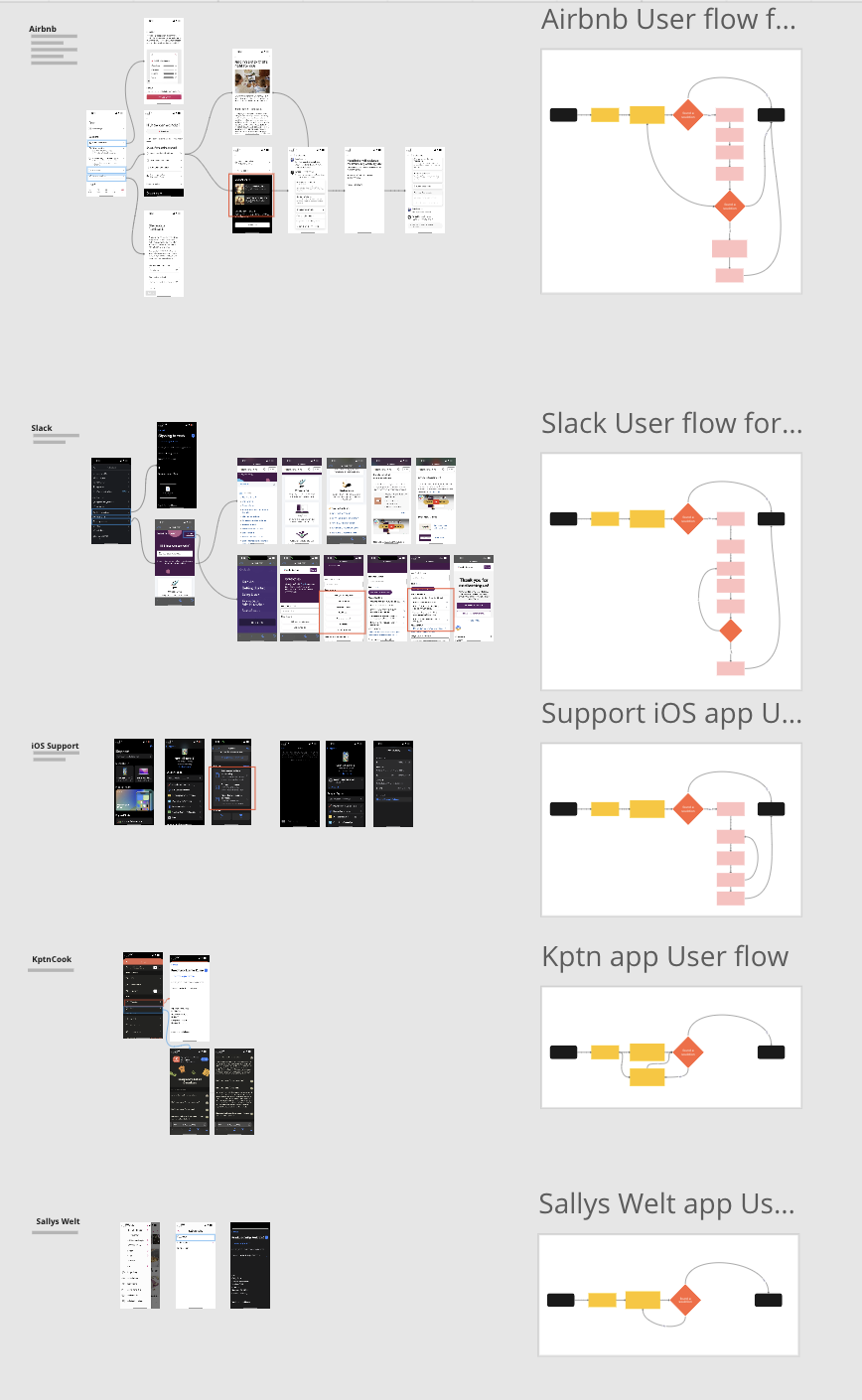
Process
Collected data from client feedback, 100+ app store reviews, customer emails, and stakeholder input.
Organized insights into empathy maps to visualize pain points :
“I sent 3 emails and got no reply!” (Ghostee Anna)
“I don’t even know where to click for help!” (Confused Cara)


Blocked Liza journey
Personas and User Journey Maps
Ghostee Anna: “No response after days—I felt ignored!”
Confused Cara: “The support email is impossible to find!”
Clueless Sara: “Why can’t I solve this myself?”
Blocked Liza: “My app crashed, and I lost my progress!”
User Journey Maps
Highlighted frustration peaks (e.g., users abandoning the app after failed support requests).
Identifying Opportunities & Inspiration
Competitive Research:Studied apps like MyFitnessPal and Headspace.
Key Insight: Competitors used chatbots and FAQs—not just email.
Structured Solutions:
Created user flow diagrams to simplify support interactions.
Extracted adaptable elements (categorized tickets, self-service FAQs).
Offering Value
“How Might We” Ideation:
“How might we make it easier for users to get faster feedback?”
Core Solutions:
Categorize Problems: Users select issue types upfront (e.g., login, payment).
Knowledge Base/FAQ: Self-help articles for common issues.
Automatic Feedback: Status updates post-request.

Prototyping
Final Concept
Smart Forms: Users submit details upfront (screenshots, error codes).
Empowerment: FAQ hub for quick fixes.
Transparency: Automated updates and progress tracking.
Iterations
Developed paper prototypes → refined in design critique sessions.
Simplified navigation: Moved support from hidden menus to the home screen.


Collaboration & Implementation: Leading Technical Deployment
Research Handoff
Action: Worked with developers to prioritize features (e.g., auto-replies > FAQ hub).
Tool: Shared annotated Figma files and user journey maps via Jira.
Challenge: Balancing UX ideals with backend constraints (e.g., real-time sync delays).
Technical Scoping
Collaborators: Backend engineers, product managers.
Outcome: Phased rollout plan:
Phase 1: FAQ hub + basic auto-replies.
Phase 2: Real-time status tracking.

Takeaways
Efficiency
60%
Categorized requests reduced resolution time by 60%.
User Empowerment
25%
FAQ hub deflected 25% of repetitive queries
Want to See More Work?
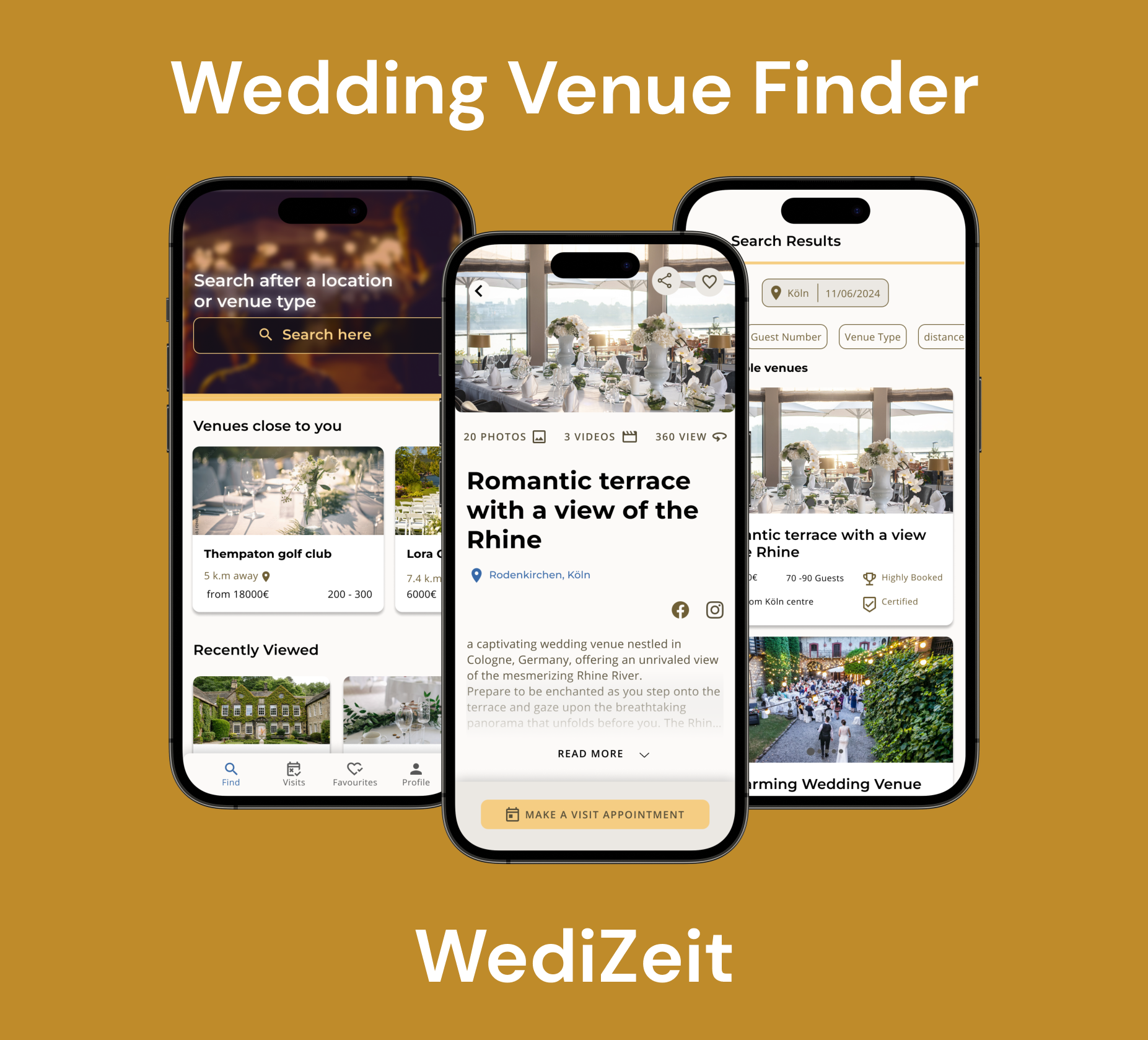
Personal UX Concept for Effortless Wedding Venue Discovery
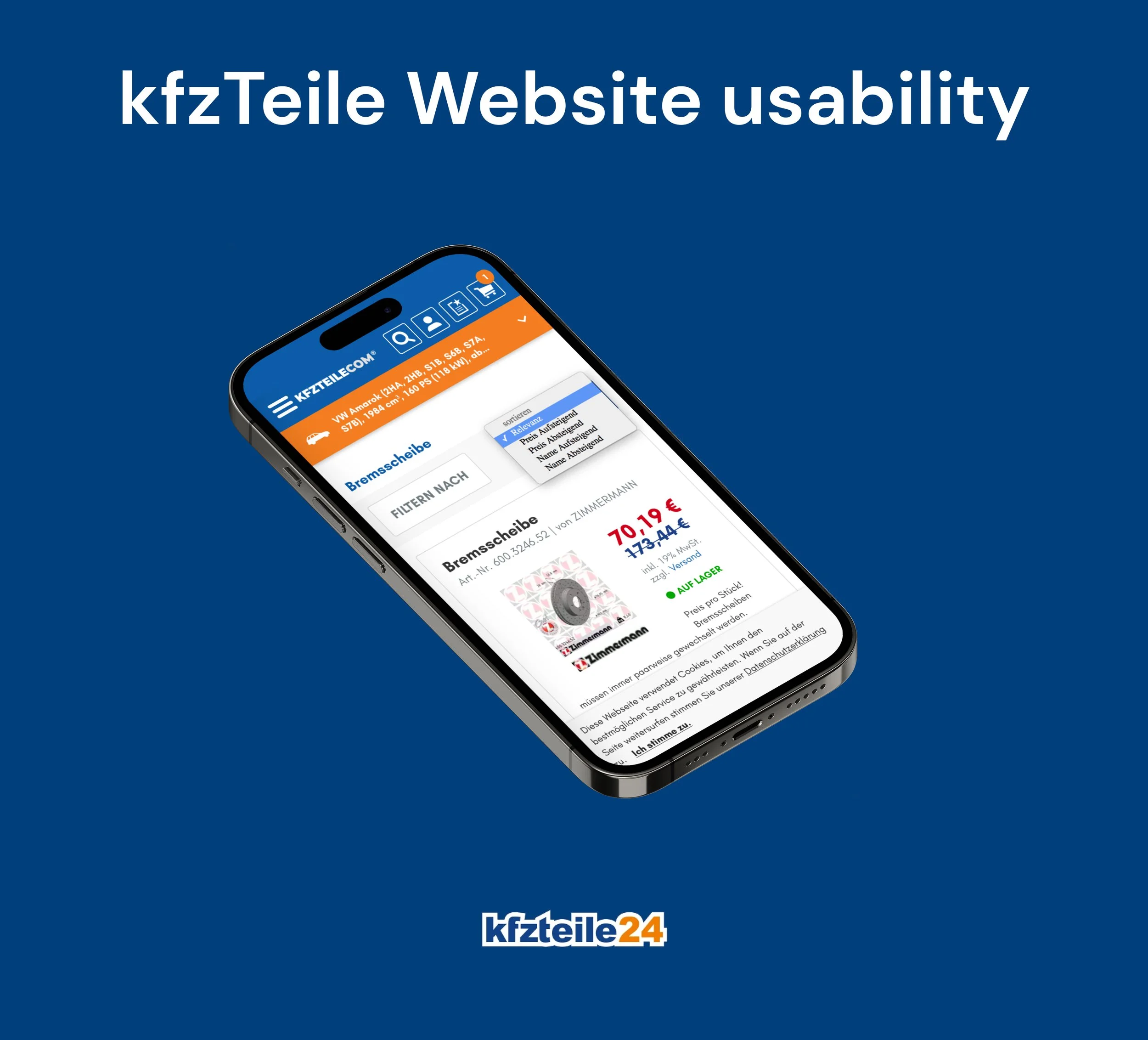
Enhancing Mobile Usability: A User-Centric Case Study
Contact Me
tarek.hassan.it@gmail.com

Location
Cologne, Germany